


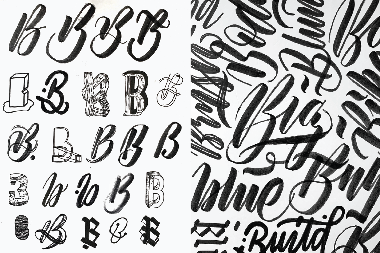
Favourite Letters
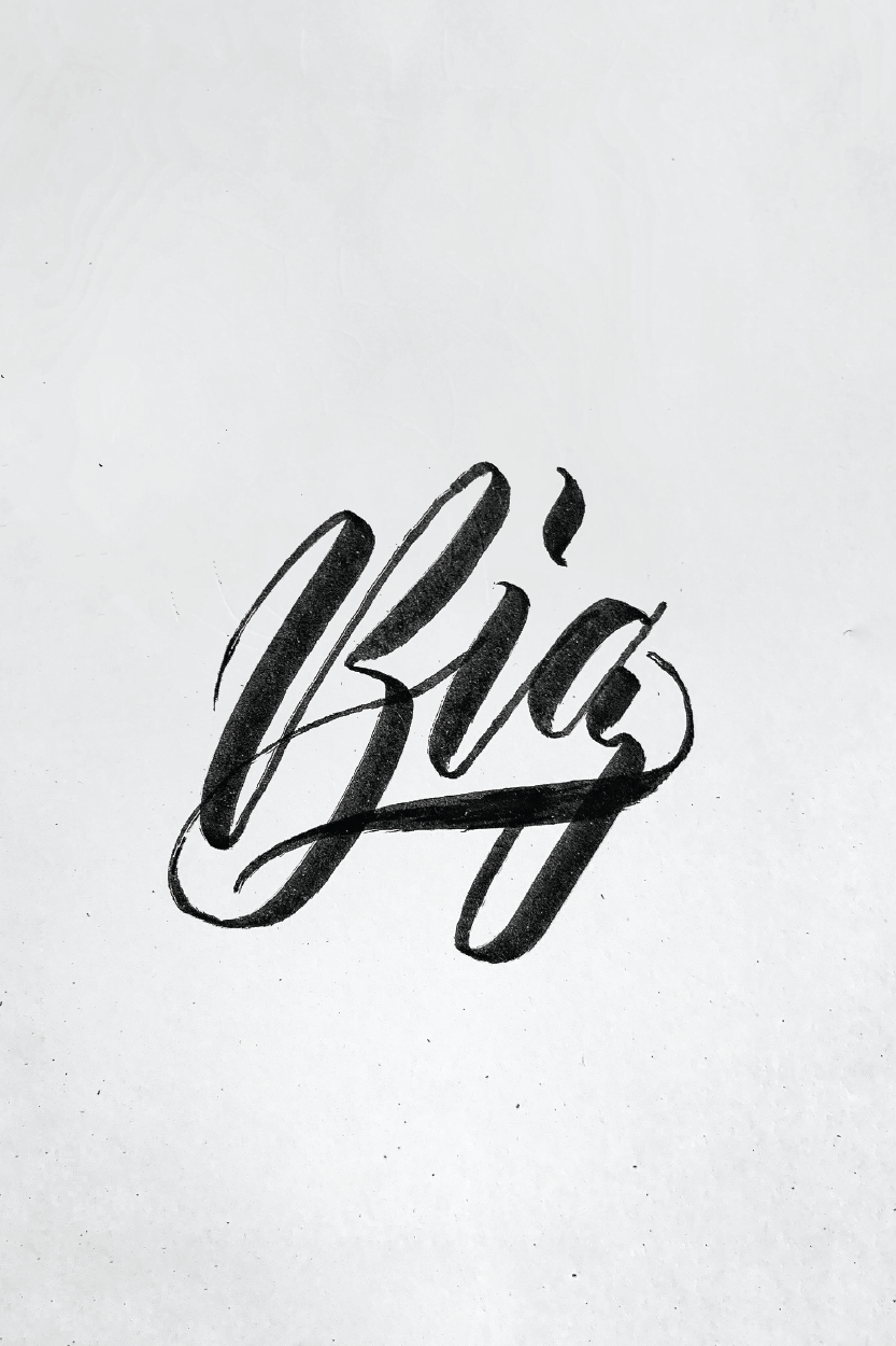
Just typing these letters makes me really excited and I have no shame in saying so. I’m sure many designers share the same thoughts about having letters or words that they extremely enjoy experimenting with. There are other letters I enjoy working with but to keep me from dwelling too much on this post, I will only be working with four letters.
My favourite letters are; B S Y A .
I have been following letterer/designer Stefan Kunz (@stefankunz) on how to improve my lettering and working outside my comfort zone through trying different styles. There were a lot of simple tips he recommended that I was surprised I didn’t think of applying earlier. One of the main tips I will religiously use from now on is to use a grid to strictly guide all my work. Eyeing the work is just lazy which is something I am guilty of practising.
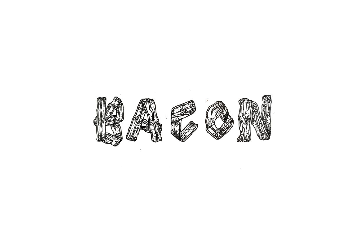
The most difficult part of creating this blog post was just deciding on which parts I wanted to share. By far, the words Bacon and Avalanche were the most enjoyable to create in this post but I also decided to upload some examples that weren’t as polished to show my process.


— Sylvia.

Least Favourite Letters
As much as I love hand lettering, there are always some letters that I always have trouble writing in a way that looks cohesive and aesthetic.
My least favourite letters to write are; F P X V.
Sometimes I try to avoid words that have those letters but I am going to challenge myself to practice writing these letters. I realised that I can’t just reject projects because they’re going to ask me to use words with a specific letter that I don’t enjoy writing. Hypothetically if Facebook needed hand lettering, I can’t just say sorry I don’t want to write F words.
Here are some sketches showing how I have been trying to make friends with these letters. It’s safe to say that I definitely dislike writing them a lot less. As with everything, you need to practice in order to understand and appreciate it. Does anyone else have letters they dislike using?


— Sylvia.